Report Preview
This component is intended for use in client-side report generation. It applies default CSS styles to make the output resemble the Chrome Print Preview screen.
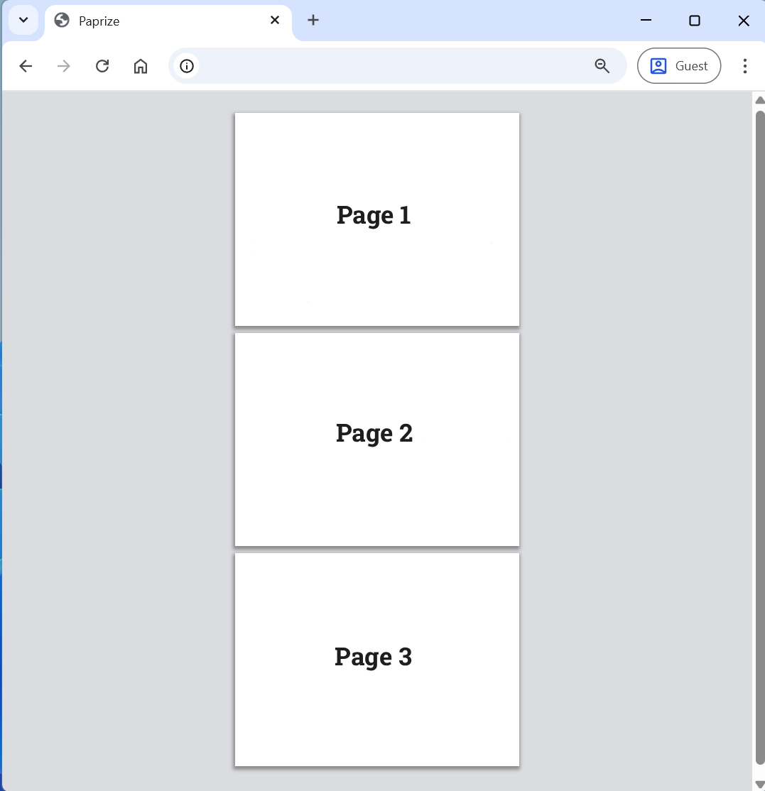
The preview component must wrap all sections in the report.
- Vanilla
- React
<div data-pz-preview>
    <div data-pz-section ...>...</div>
    <div data-pz-section ...>...</div>
</div>
Recipe
<ReportRoot>
    <ReportPreview>...</ReportPreview>
</ReportRoot>
Recipe
info
Since you don’t have control over the client’s browser, user extensions may inject extra elements into the page and cause issues when printing. The Report Preview component ensures a clean output by hiding all non-Paprize elements during print.
Styling
You can customize it by changing the CSS variables or by creating your own styling component.
--paprize-page-background-color: #ffffff;
--paprize-page-margin-bottom: 10px;
--paprize-page-box-shadow: rgb(142 138 138) -1px 3px 5px 2px;
--paprize-section-margin-bottom: 10px;
--paprize-preview-background-color: rgb(218 220 224);
--paprize-preview-padding: 30px 10px;
When creating custom styles, ensure they are applied only to screens by using screen CSS media query. The available class names include:
@media screen {
    .paprize-preview {
    }
    .paprize-page {
    }
    .paprize-section {
    }
}